Creating a User-Friendly UI for Applications: Our Approach with Apex Engine
 Have you ever used a development application that was almost perfect, except for the UI? Maybe it was the confusing iconography, a layout that never seemed to stay the same, or essential tools hidden behind endless dropdowns. We've all been there. Take a moment: What application have you used that had an amazing UI? And which one drove you up the wall?
At TGS Tech, we’ve spent decades building and using 3D development platforms. Through that time, we’ve learned what works and what frustrates even the most seasoned users. So when we began designing the UI for Apex Engine, we started with a simple but important goal: make it intuitive, consistent, and customizable. Here's how we're doing it.
Designed by Developers, for Developers
We didn’t just sit in a room and guess what people wanted. Apex Engine’s UI is the result of years of hands-on platform development experience and, more importantly, years of listening to our clients and community. We’re also developers ourselves. That means we use these tools every day. Our focus is on keeping the learning curve low so users can jump right into building, not spend hours figuring out where the terrain brush went.
Our Phase 1 development overview highlights this exact focus on building a developer-first experience, starting with the tools and workflows developers need most.
Evolution, Not Confusion
Functionality and feature sets will grow over time. That’s expected. But nothing is worse than logging in after an update and not being able to find your tools. With Apex Engine, we’re building the interface to evolve gradually, without disruptive changes that force users to relearn everything. The UI will continue to improve, but the core layout and tool placement will remain intuitive and familiar.
You can follow some of these updates in our UI-focused Dev Log, where we discuss our incremental approach to updating Apex Engine’s interface.
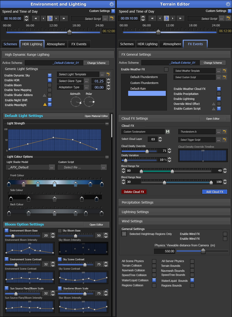
Icons That Actually Make Sense
Icons are a major part of navigating any UI, but far too often they’re abstract or unclear. We believe every icon should visually relate to its tool’s function. In Apex Engine, icons are designed for instant recognition. You shouldn’t need to hover over something just to know what it does. Clear visuals help speed up workflows and reduce fatigue, especially during long development sessions.
Aligning with Industry Standards
Every industry has its own visual language. From game development to architecture, simulation, and medical design, users often expect certain icons to look and behave in specific ways. While we are creating our icons in-house to maintain a consistent and polished style, we are making sure to align with those industry-standard visual cues wherever possible. Whether you're used to blueprint icons in architecture tools or animation curves in media software, Apex Engine’s UI will feel familiar, not foreign. Our goal is to provide clarity and comfort, even if it's your first time using the platform.
This philosophy is echoed in our article on Consistency and Design, which breaks down the importance of aligning usability with visual identity.
Layouts and Colour That Work Your Way
One of the most powerful features we’re integrating is custom layout management. Different tasks require different workflows. When you’re importing terrain, you may want more screen space for visualization. When scripting, you might want the code editor front and center. With Apex Engine, you can create, save, and switch between custom layouts so you always have the right tools in the right place for the job. No more one-size-fits-all interface.
This is further supported by tools like our Code Editors and GUI Editor, which give users flexibility in how they build, script, and manage their interface elements.
A Thoughtful Color Scheme
We’re starting with a dark-themed UI that’s easy on the eyes, especially during long working hours. But we know not everyone prefers dark mode, so a light theme is also planned. Rather than harsh blacks or bright whites, we’re using a range of grey-based tones to reduce contrast strain and support better focus. These choices are designed to minimize fatigue while still keeping the interface visually clear and professional.
If you're interested in the visual strategy behind these decisions, take a look at our recent feature on Qt and UI/UX design for Apex Engine.
Smart Tools, AI Assistance & Accessibility
Apex Engine is being built with AI-powered assistance to help streamline workflows, reduce repetitive tasks, and guide users through more complex actions. We’re still evaluating the best placement and presentation for AI tools, since many features will include some level of intelligent automation or suggestions over time. Our goal is to ensure that AI support is non-obtrusive and feels natural. It should be quietly helpful when you need it, and invisible when you don’t.
Whether it’s helping generate code, adjusting terrain settings, suggesting asset placements, or assisting with physics tuning, AI in Apex Engine will be available right where and when you need it, always focused on enhancing productivity, not slowing you down.
Accessibility and Ease of Use
We’re committed to ensuring the UI is accessible for everyone, including users with visual sensitivities, mobility challenges, or other accessibility needs. Button sizes, font options, spacing, and contrast settings are all part of our long-term design roadmap. Good design is not just about appearance. It’s about usability for all types of users.
AI will also play an important role in accessibility. By learning user preferences and interaction patterns, it can help suggest optimized layouts, adjust visual settings, or even read tooltips aloud when needed. Over time, AI can adapt the interface to better support different working styles and accessibility requirements, making Apex Engine more inclusive and user-friendly for everyone.
A Few Last Words
User interfaces can make or break an application. With Apex Engine, our UI philosophy is simple: make it clear, customizable, and consistent. We’re building a platform that works with you, not against you. Because in the end, the best tools are the ones that let you focus on your creativity, not figuring out how to use the software.
We’d love to hear from you. What UI features do you wish more development tools had? What’s your favorite (or least favorite) interface to work with? Let us know as we continue shaping Apex Engine with the community in mind.